1. Main Page
On the Main page of the NHC website, you will immediately find yourself looking at a map of the Atlantic, the Caribbean, northern South America, and eastern North America. A key at the bottom of the image explains color coded X’s and cyclone formation. But what do those really mean? The ‘disturbances’ (marked by a yellow, orange, or red X) are essentially really big thunderstorms that have ideal conditions to become a hurricane. Hurricanes need low wind shear (nothing to oppose them), lots of warm water, and low atmospheric pressure in order to form and maintain shape. If it’s been an extremely hot summer, you can almost count on an active season. In 2005 there was record warmth…and the most active hurricane season recorded (28 tropical cyclones, 15 turned into hurricanes). After a disturbance is recorded, it has the potential to become a tropical storm, a hurricane, or a major hurricane. A tropical storm has maximum sustained winds of 39 to 73 miles per hour. Anything more becomes a hurricane; and after 111 miles per hour the storm is considered a major hurricane. Tropical storms, hurricanes, and major hurricanes are all different forms of tropical cyclones with different maximum wind speeds. All of them can be dangerous if you are not properly prepared.
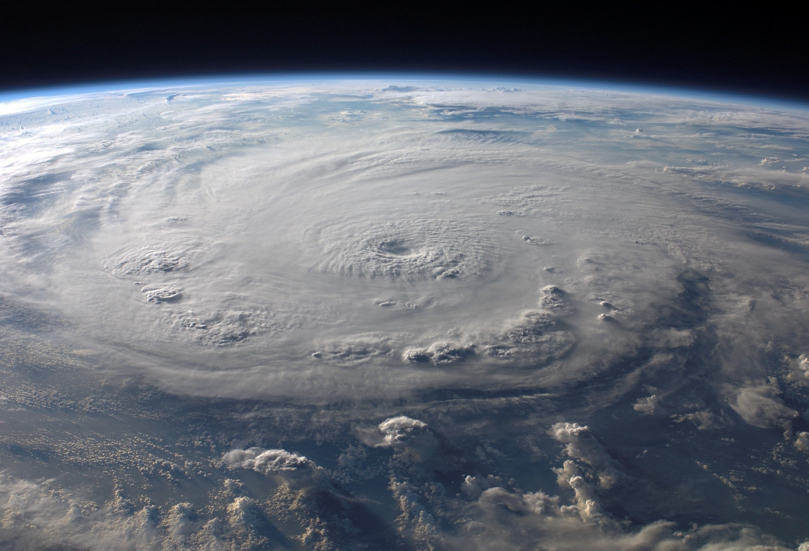
2. Data & Tools > Satellite Imagery // Data & Tools > Analysis Tools
This is where the meat of the NHC lies. I have spent countless hours looking through infrared loops and images with every hurricane, tropical storm, and depression. Personally, my favorite view is of the Caribbean, but you are free to choose. Under each regional view will be a small list of options: GeoColor, Visible, Shortwave-IR, IR, and Water Vapor. I’ll explain all their functions in the next section. First, it’s important to understand what all these links are for. The NHC website is, essentially, one giant data dump. There is immense access to everything past and present. If you find yourself exploring; you’re likely to stumble across the observation data and pages of text. While they can be a hard to understand for non-scientists, they contain important information about storm center location, speed history, wind history, sea surface temperature, etc. All of which are vital to accurate forecasting. You’ll want to stick to the pictures. They are much easier to digest and are also easily found if you know where to look! Don’t worry: Lizzie spends hours on the website so you don’t have to. Satellite imagery is best for your run-of-the-mill, public consumption hurricane imagery. These will likely be the kind of stuff you see on your local weather channel, accessible on your computer or phone. Under Satellite Imagery, you can scroll to your preferred view and select a GOES image. GeoColor and Shortwave IR are best for quickly understanding what the storm looks like and its intensity. Under Analysis Tools, you’ll find a table with a few different types data. One of the most important is Sea Surface Temperature. With this graphic, you can form your own prediction about where the storm will hit! Fun Tip: Print out a blank tracking map from Data & Tools. Record the path you think the storm will take, the NHC’s prediction, and the actual path. After several days, you will see who was more accurate!
3. IR? GeoColor? Clean and dirty?
First things first: IR means infrared! This is likely the most comprehensible of the viewing modes. As you get closer to the center of the storm, the worse conditions get. Thus, the image goes from blue, to green, to yellow, to red. As you might have already guessed, a giant red blotch is definitely something to be worried about. My favorite view is clean longwave IR. I know; Lizzie what does that even mean?! Believe it or not, storms are hot (hence, the red center). Hurricanes in particular are massive energy deposits that love high temperature surface water and low pressure. But back to viewing: clean IR will pick up less water vapor interference than dirty IR. The difference is not that important for viewing purposes, and is really a matter of personal preference. Whatever band you use, you should understand what you’re looking at. GeoColor is the simplest: it shows land and ocean in full color, and the full expanse of storm clouds. With any longwave infrared viewing, just remember that red is almost always bad. I don’t like to use shortwave because it can be harder to conceptualize that a blue storm is bad. Whichever you choose, remember the readings will be in Celsius. As a relative point of conversion, remember 28/82 and 16/61. 28 degrees Celsius is 82 degrees Fahrenheit, and 16 degrees Celsius is 61 degrees Fahrenheit.
4. Be Prepared
Whether you’re new to hurricanes or have lived with them for years, one thing is certain: being unprepared can have disastrous consequences. There are many resources online provided by both citizens and the government on how to best prepare; keep in mind there is no single correct way to prepare. Your best chance will be to start as early as possible, and don’t leave anything to chance. Prepare for the worst, hope for the best. On the NHC main page, follow the Education Resources tab for their extensive database of hurricane preparation including, presentations, publications, and even games (if you have kids) that teach about the ideal conditions for a hurricane.

